Loading...
elearning Campus BlogDescriptive vs Inferential Statistics
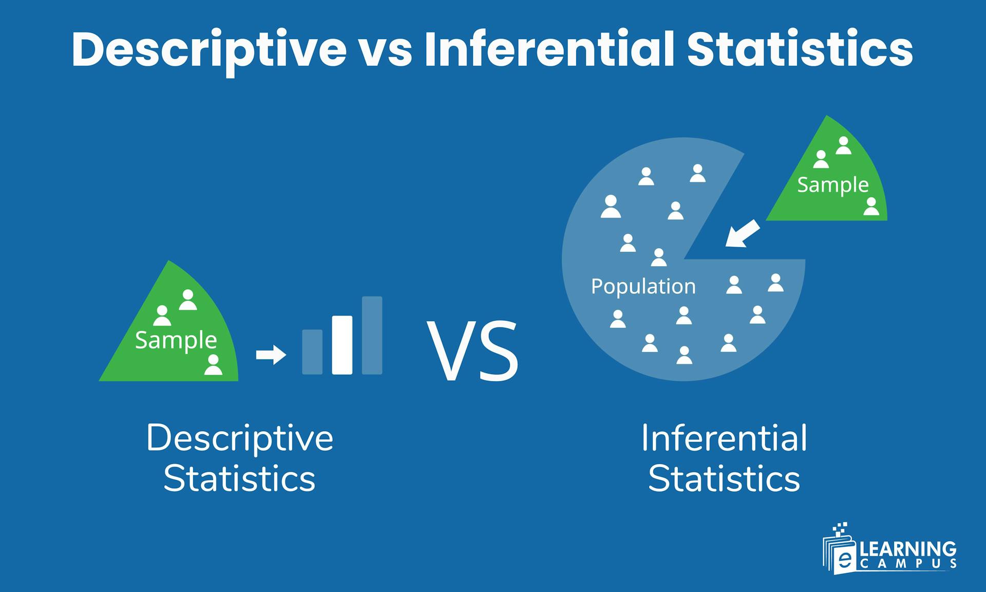
Descriptive vs Inferential Statistics
Have you ever wondered how researchers describe large sets of data so simply, or how companies predict future sales, trends or customer behaviour with just a small sample? This could be possible with the right approach in statistics. Descriptive statistics summarise data, and inferential statistics use that data to make decisions, predictions or test theories.
In this blog, we explore how descriptive and inferential statistics help to make data useful and their importance and how we can use them to summarise data and make predictions.
What is Descriptive Statistics
Descriptive statistics is a method used to describe and summarise the main features of the dataset. They do not make predictions.
For example
- A shop calculates its average daily sales are 30,000
- The store finds that the zinger burger is the most ordered item
- A graph shows that most of the customers are between 18 to 30 years.
They only show what your data shows.
Functions of Descriptive Statistics
Descriptive statistics help us to describe the data clearly. Whether you are analysing student performance, tracking business sales, or studying research results, descriptive statistics provide the basic tool to summarise the data. The main functions of descriptive statistics are :
- To organise data
- To summarise data
- To present data clearly
Categories of Descriptive Statistics
Descriptive statistical tools are mainly divided into 3 major categories
- Measure of central tendency (mean, median, mode)
- Measures of dispersion (variability, Range, variance, standard deviation or IQR)
- Data presentation tools(tables,charts,graphs)
Measure of Central Tendency
Measures of central tendency include mean, median, and mode, which show the single value that best represents the entire group of data. They tell us about the typical, central or most representative value of data. Measures of central tendency include;
Mean
The mean is the sum of all values divided by the number of values.
Formula
Example
Data =5,10,15,20
Put it into the formula
Median
The median is the middle value when the data is arranged in order.
For example
Data =3,6,10
Then the median is 6
Mode
It is described as the most frequent or repeated value in the dataset
Example
data =2,5,5,10
Mode =5
Measure of Dispersion
These tools show the spread, variability or how far data values are from the centre of the database. Measures of dispersion include range, variance and standard deviation.
Range
The range shows the difference between the largest and smallest values.
Formula
Range = Maximum -Minimum
Example
Data =10,20,30
=30-10
=20
Variance
Variance measures how far each number is from the mean.
Formula
Standard deviation
Standard deviation is defined as the square root of variance. It indicates the stability or instability of your data.
Formula
Interquartile Range(IQR)
IQR tells the spread of the middle 50% of the data. It removes the outlier (extremely high or low values ).
Formula
Data Presentation Tools
These tools help visualise and organise data so that patterns are easy to understand. It includes;
- Tables
- Frequency distribution
- Charts and graphs
Tables
Tables organise data in rows and columns that make it easy to read, compare and look up values.
For example
Student
Score
A
40
B
30
Frequency Distribution
Frequency distribution shows how often each value or range appears.
Example
Score range|frequency
70-79|4
80-89|6
Charts and Graphs
- A chart is the visual representation of data that uses symbols such as bars, lines, slices or pictures to make information easier to understand.
For example, Bar chart, pie chart, line chart, etc.
- A graph is a visual tool that shows the relationship between two or more variables, usually plotted on axes. Graphs help to see patterns, trends, changes or correlations in numerical data.
For example, a line graph, a scatter graph, etc.
What is Inferential Statistics?
Inferential statistics goes beyond the data and helps you make predictions, decisions or conclusions about a larger population based on a small sample.
Examples of Inferential Statistics
Surveying 100 people to predict national election results
Analysing 50 students' scores to estimate the performance of all students.
Predicting next month’s sales from past data.
Tools of Inferential Statistics
The main tools of inferential statistics are;
- Hypothesis testing
- Confidence intervals
- Regression analysis
- Correlation
Hypothesis testing
It is a statistical method used to make decisions or conclusions about a population based on a sample of data. It helps you check whether a claim, assumption or belief is true or not using data.
Example
- Do online classes improve student performance?
- Is the new medicine more effective
Confidence Intervals
These give a range of values likely to contain the true population value.
Example
The average height is 165 cm with a 95%confidence interval of 160-170 cm.
Regression Analysis
It will help predict one variable using another.
Examples
Predicting sales using advertisement spend
Forecasting temperature
Correlation
It measures the relationship between two variables
Examples
- Height and weight
- Study hours and marks
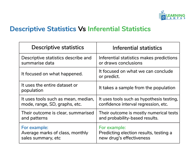
Descriptive Statistics Vs Inferential Statistics
Descriptive and Inferential statistics are the two core branches of statistics. Both work together. You first describe your data, then infer something from it to support decision-making. Both are applied in business, research, economics, healthcare, marketing and mor
Explanation
- Descriptive statistics answer what does data show, while inferential statistics mean to answer what we can conclude beyond the data.
- It is used to describe a situation. It is used to describe the chance of the occurrence of an event.
- Descriptive statistics help you describe a dataset, while inferential statistics help you infer or predict something about a larger population based on a sample.
- Descriptive statistics include tools like mean, median, mode, percentage and charts. Inferential statistics include testing, confidence intervals, correlation and regression.
Importance of Descriptive and Inferential Statistics
Descriptive and inferential statistics are both essential for understanding and using data effectively.
Descriptive help summarise and organise large datasets, using mean, median, mode, range and visual tools such as tables or charts. Inferential, on the other hand, allows us to make predictions and generalise about a population based on a sample, test hypotheses and make evidence-based decisions in business, research, and healthcare.
Conclusions
Descriptive and inferential statistics are core tools in statistics that help us analyse and interpret data. Together, they offer a complete understanding of data, helping businesses research and policymakers analyse trends and make informed choices.
Learn Math online with expert Tutors
Wanted to summarise data or make predictions from data? Don't worry, our expert online math tutors can help you. Learn how descriptive and inferential statistics can help you analyse trends and make smarter decisions today. Get benefits from our online tutoring service and start learning math, statistics now.